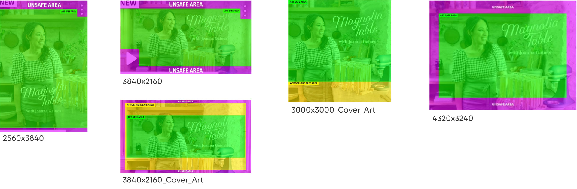




Key Art
Core Assets
Key Art Core Assets
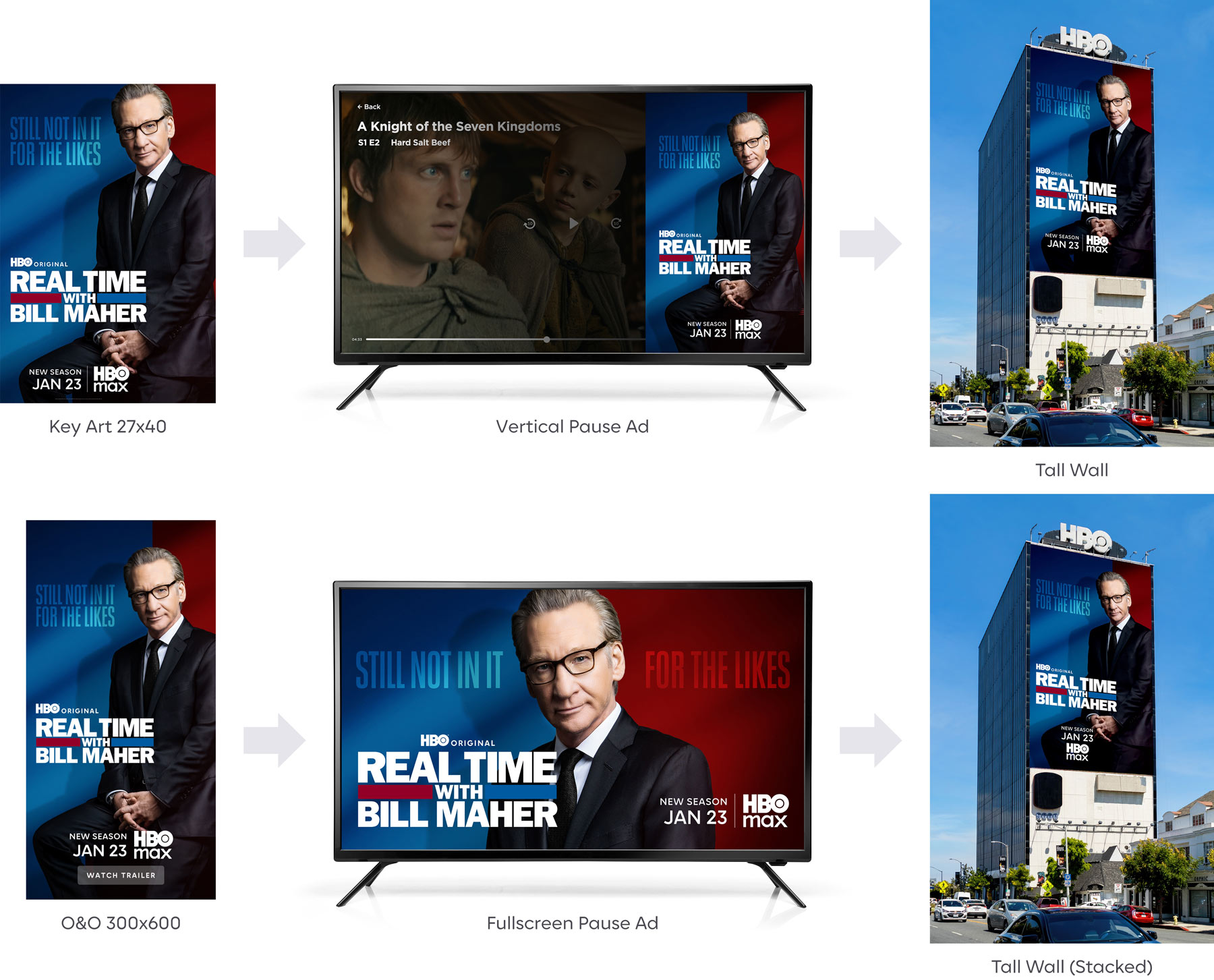
The “key art core assets” are the foundation for building out campaigns. The term key art is used to describe the source art for brand, theatricals, originals, and non-originals. These high resolution assets are used to build out various formats — including OOH, platform, O&O, digital display, and social media. See individual sections for guidance.

Specs & Deliverables
The following deliverables must be provided when delivering key art:
Key Art Call Sheet
Provide usage information on all images and fonts used in the artwork.
Note: Extending backgrounds using Generative Fill is permitted, but any other use of AI must be vetted through legal.
Key Art Assets (layered INDD at 50% scale)
Please see the Photoshop files linked to the InDesign template for dimensions, resolution, and bleed details.
- Vertical 27"x40"
- Horizontal 48"x14"
- Square 30"x30"
Social Media Key Art Assets (format: JPG and PSD)
Please use the latest templates sized for Retina 4K.
- 1:1 Facebook & lnstagram (use square 30"x30" format)
- 4:5 lnstagram
- 9:16 lnstagram Story
- 16:9 Twitter
Key Art Title Treatment
Please provide the color version in Adobe Illustrator format for vector-based title treatments, or a layered Photoshop file for bitmap-based title treatments. Preferably in RGB.
If there are both vertical and horizontal versions of the key art title treatment available, please provide both.
For Originals Key Art Core Assets Delivery
Contact: KADelivery@wbd.com and ask to be added to the Dropbox folder.
Guidelines
Key art design combines fixed and fluid elements to engage viewers with a variety of programming.
Originals
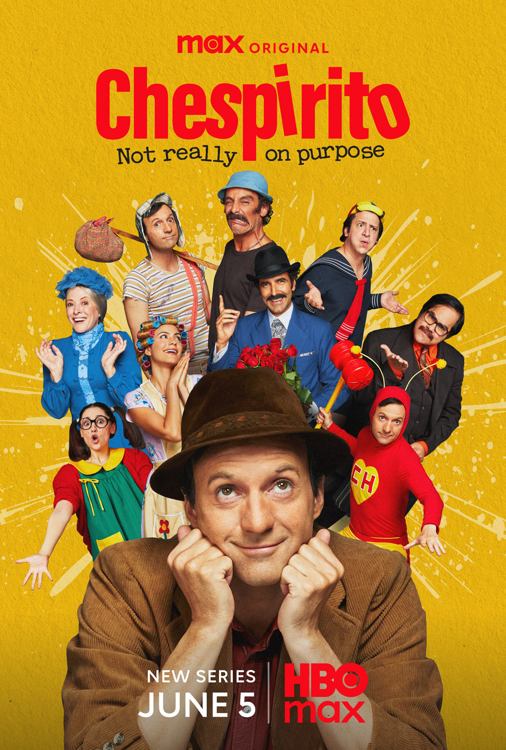
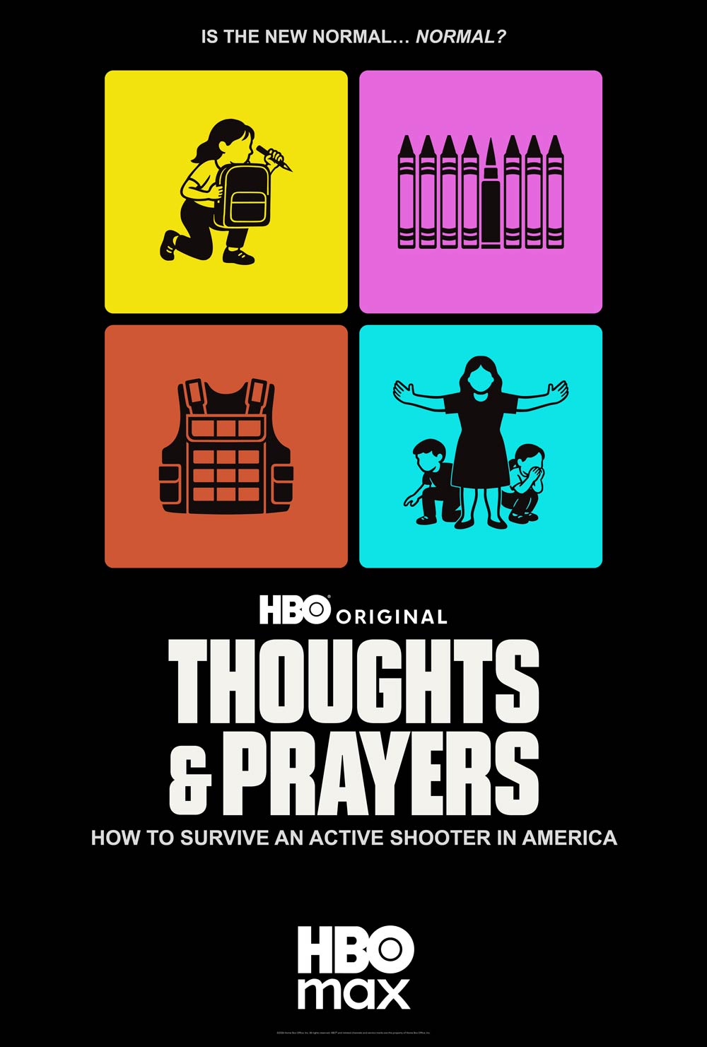
The attribution (HBO Original or Max Original) appears above the title treatment.
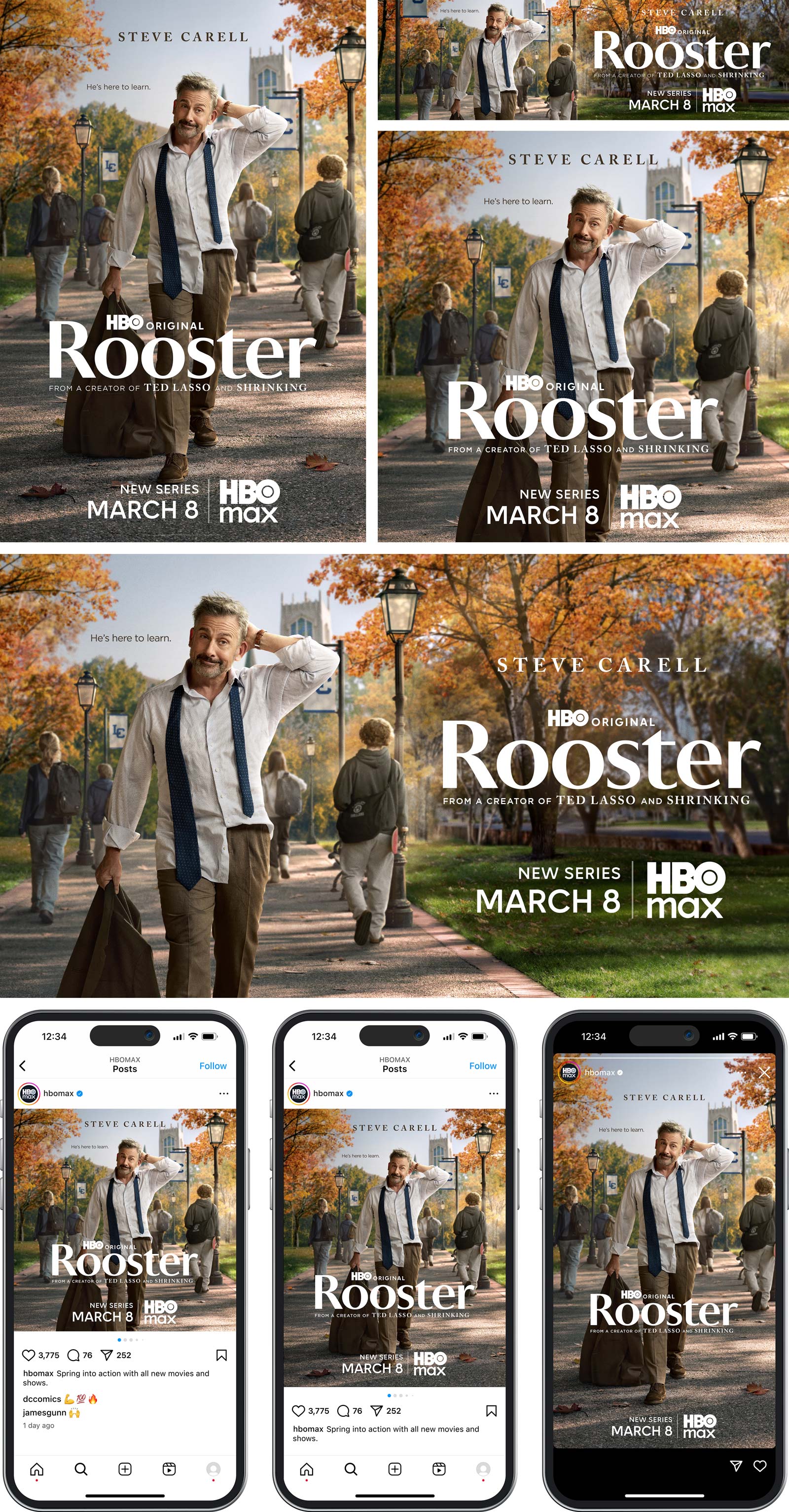
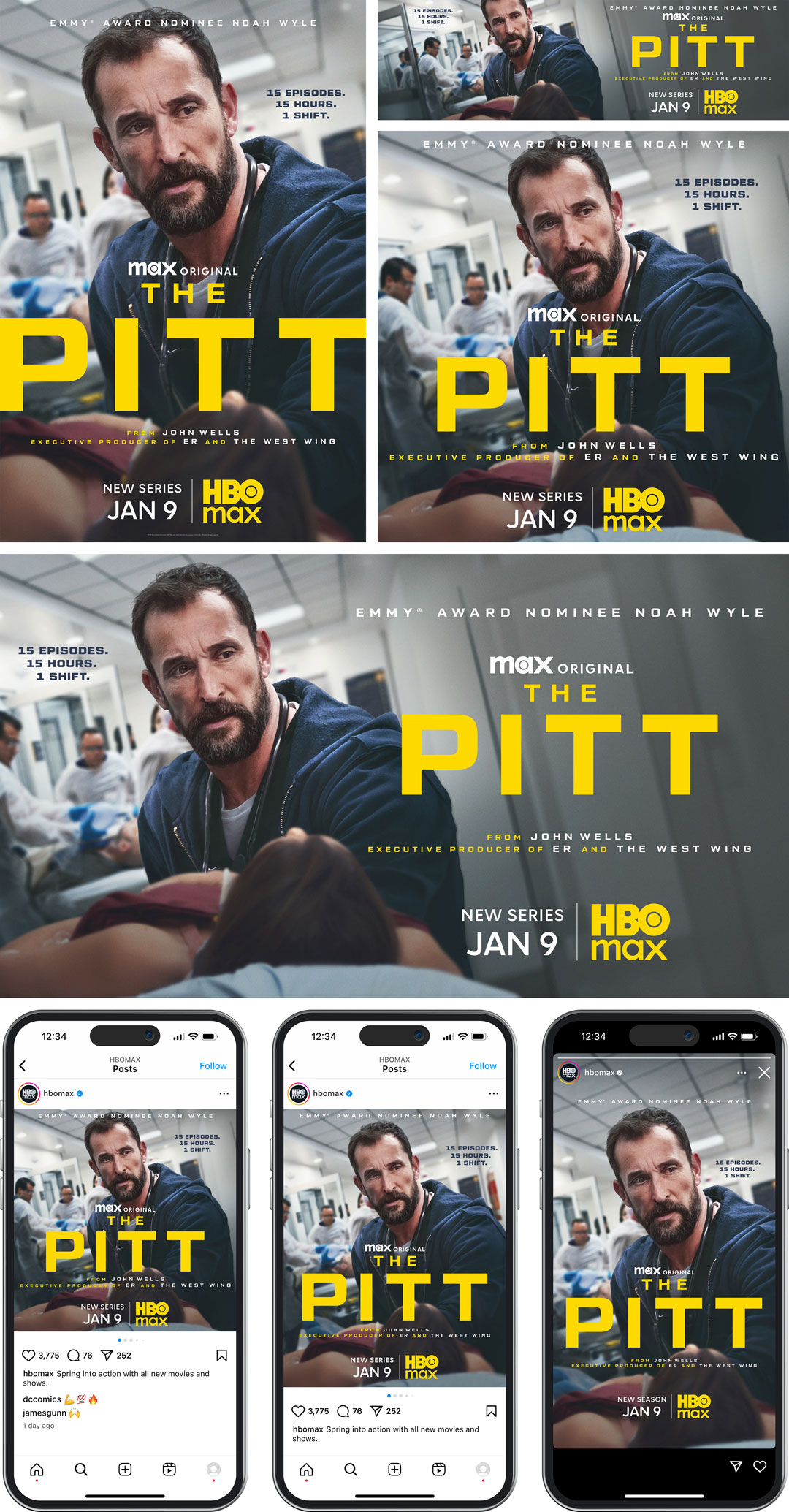
Color
- Attribution: Use obsidian black, pure white, or the title treatment color. Available in vector.
- HBO Max logo: Use the title treatment color.
- Genre indicator and tune-in date: Use the brand attribution color, such as pure white (see above). However, use the tagline color when the title treatment and HBO Max logo are in white (see The Last of Us).
Color FAQs
- Can the title treatment, tagline, and other elements be in the same color? Please avoid this. Use the same color for the title treatment and the HBO Max logo, but choose a different color for the tagline. This creates a visual brand connection between the content (series, movie) and the product (HBO Max).
- Can more than two colors be used? It's best to stick to two colors; otherwise, the design becomes too busy.
- When the title treatment includes multiple colors, which color should be chosen? Select the color that is best suited for the art.
Spacing
- The distance between the attribution and the title treatment should be equal to the cap height of "ORIGINAL."
Tune-In and HBO Max Logo Lockup
- Visually centered to the key art and placed at the bottom. However, this lockup can be moved up or down as needed but must always stay below the title treatment.
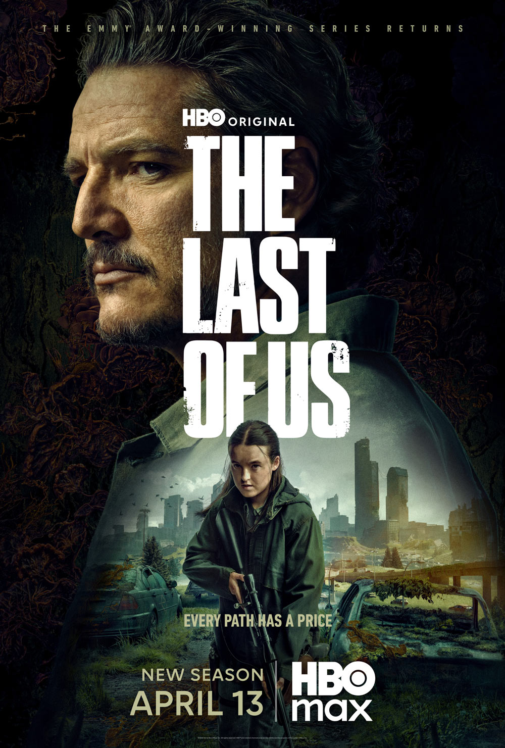
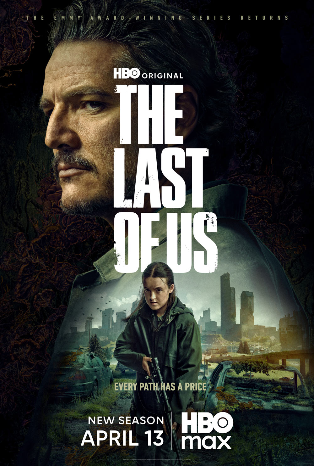
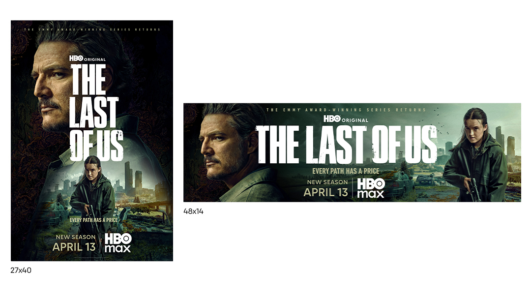
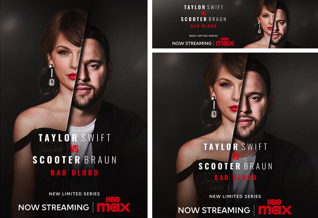
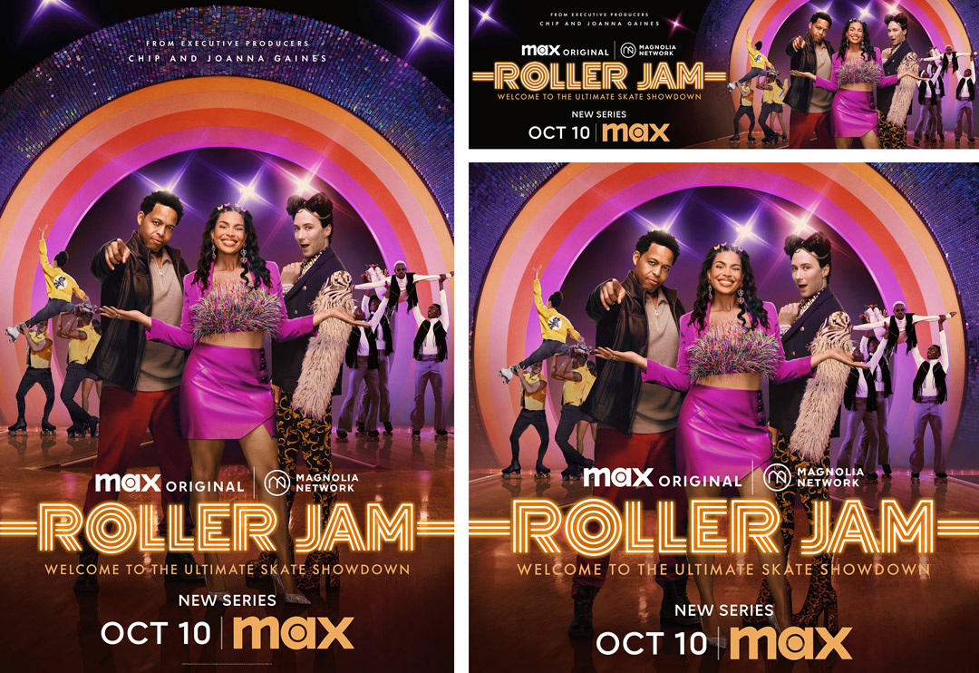
Key Art Elements
Color Contrast
To improve readability and user experience:
- Use a color contrast checker (e.g., WebAIM, contrast ratio tool, or Copilot).
- Enter the foreground (text) color and the background color.
- Verify that the contrast ratio meets Web Content Accessibility Guidelines (WCAG) AA minimum requirements:
- Normal text: 4.5:1
- Large text: 3:1
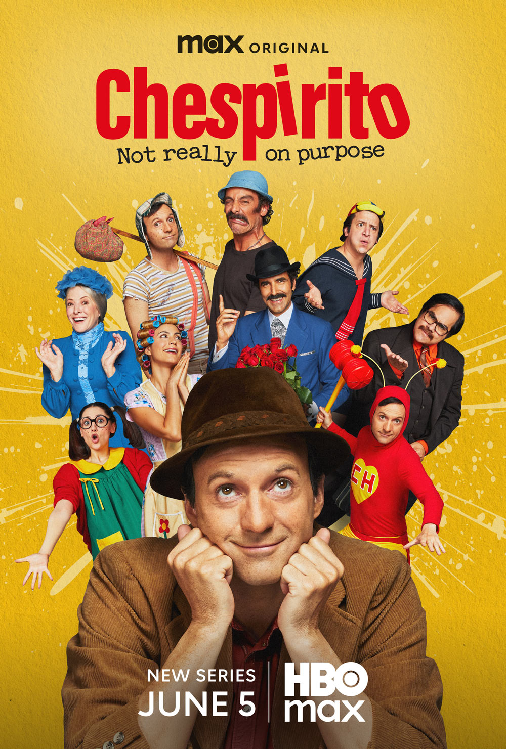
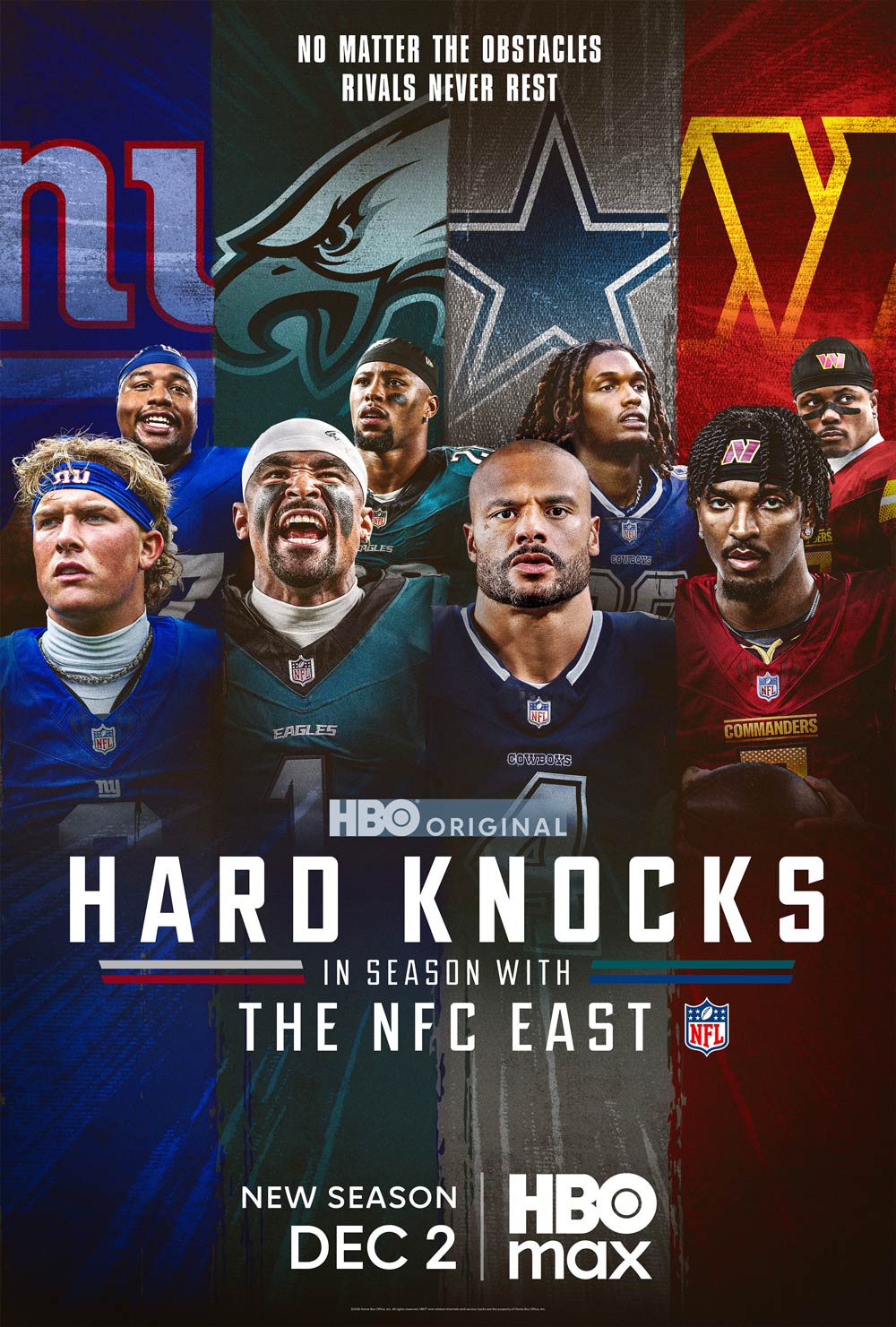
The attribution, title treatment, HBO Max logo, and tune-in all meet the minimum AA color contrast ratios.
The red attribution, title treatment, and HBO Max logo do not meet the AA color contrast requirements against a background.
Attribution Ratio
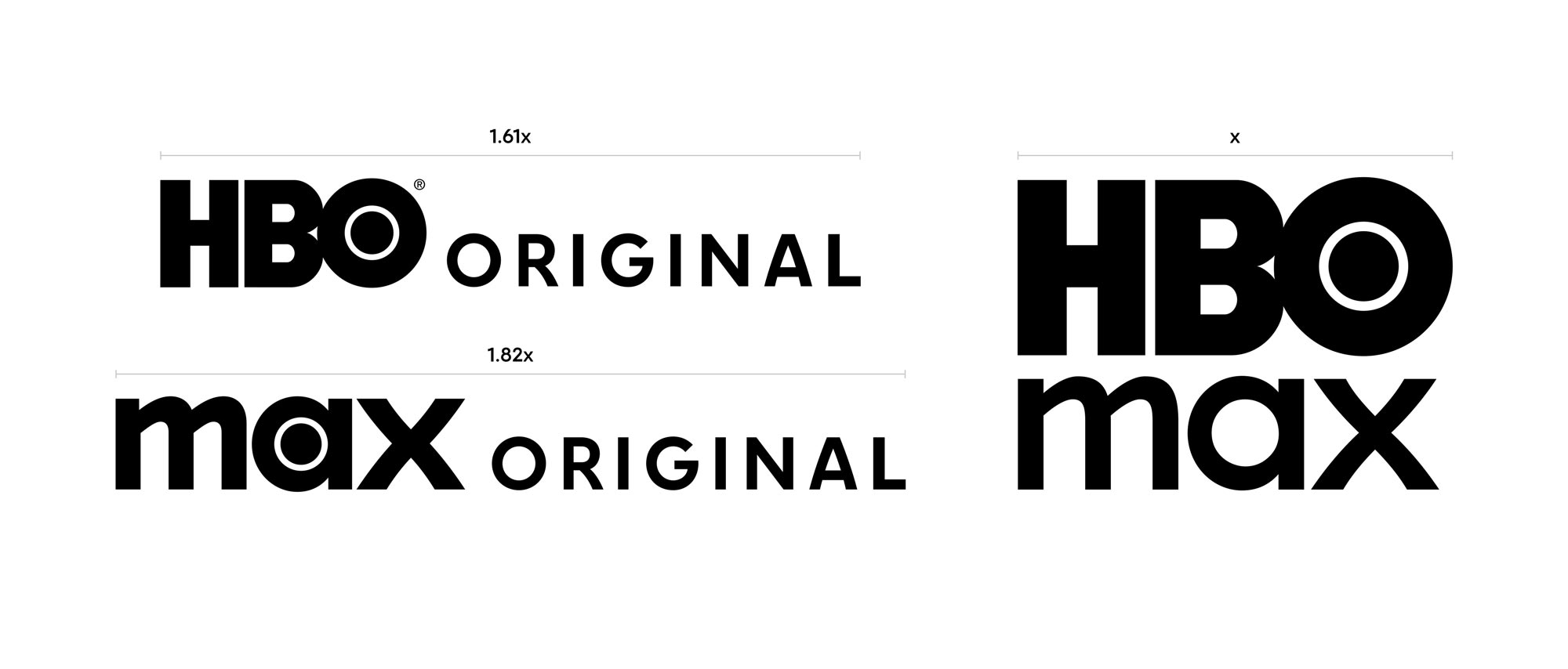
Maintain the attribution-to-HBO Max logo ratio
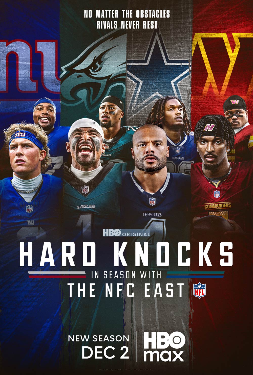
Don't scale the attribution.
Title Treatment
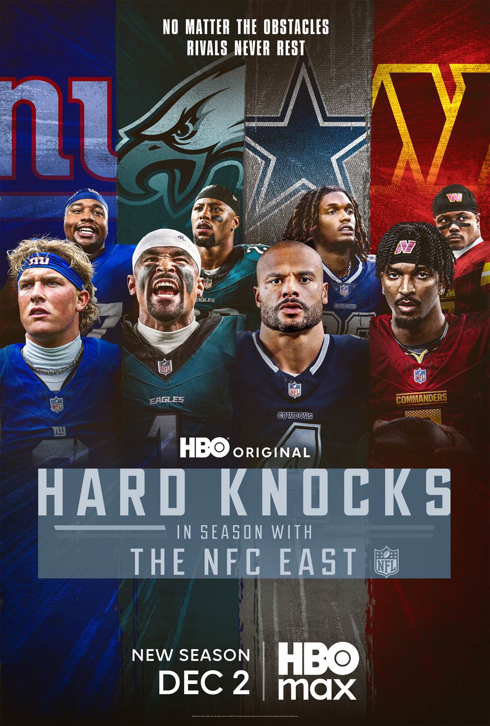
Scale the title treatment to be visually balanced with the attribution.
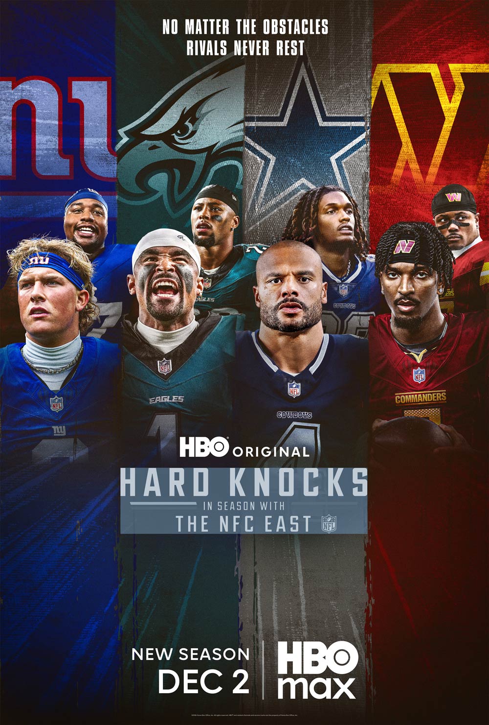
Avoid scaling that hinders the readability of taglines or pedigrees.
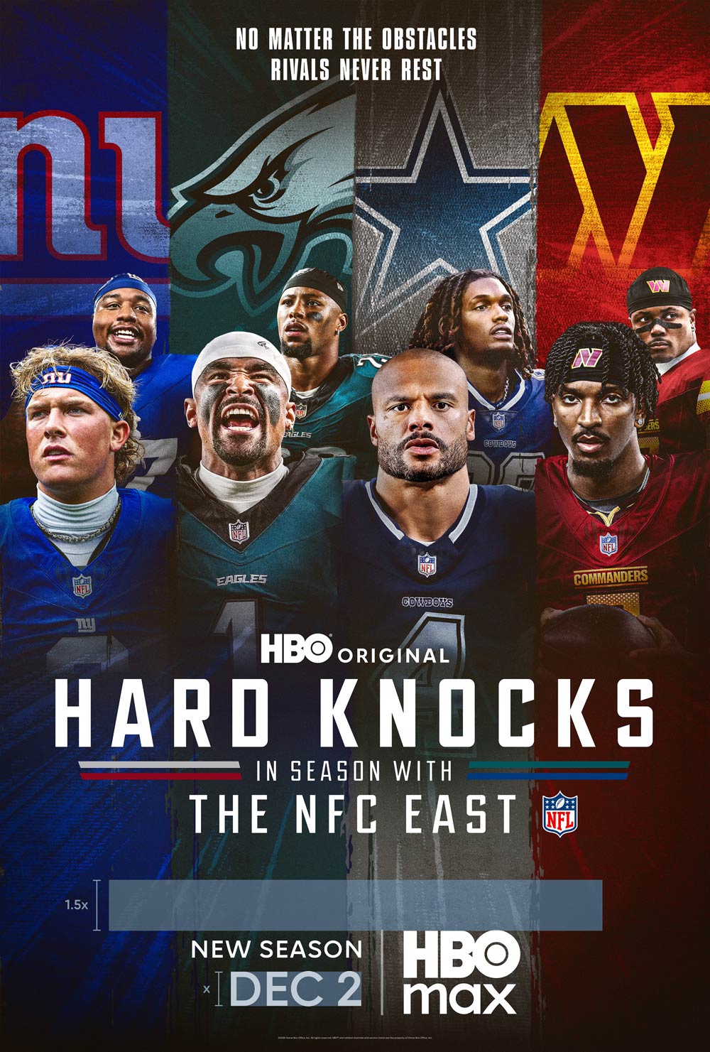
Maintain space between the title treatment and tune-in lockup for readability. The recommended minimum distance is 1.5x the tune-in date height.
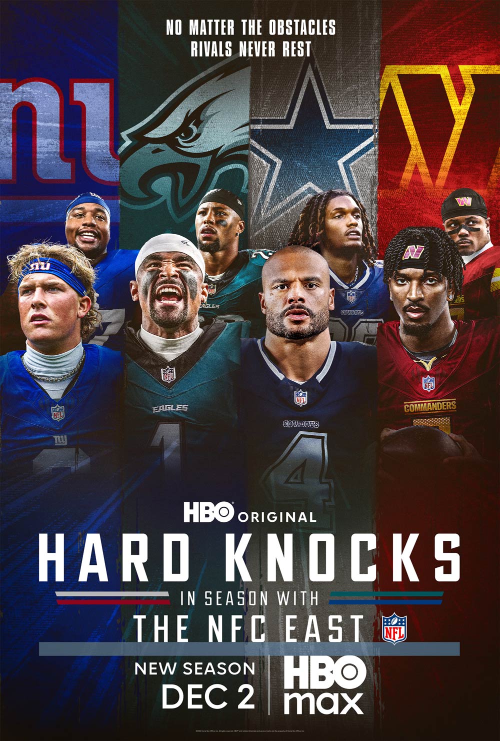
Do not clutter the tune-in lockup.
Tune-In Templates & Layers
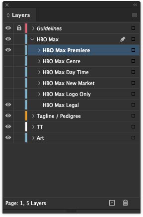
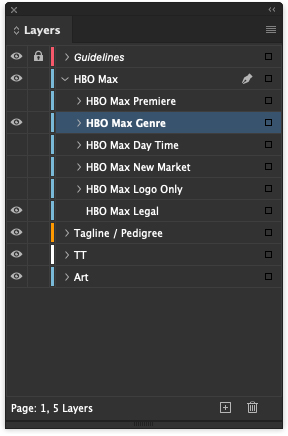
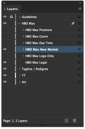
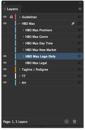
Tune-in configurations are built into the template and can be found in the HBO Max layers in Photoshop and InDesign. See below to locate the appropriate layers based on use case. For copy guidance, refer to the “Tune-In Formatting” section that follows.
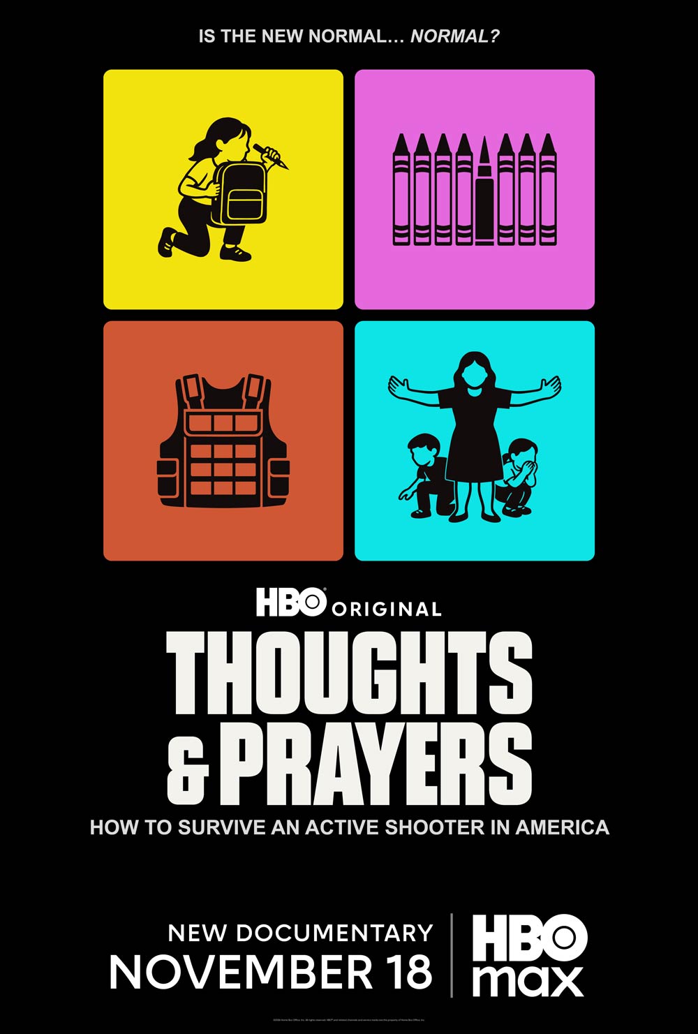
Premiere: Genre indicator ("NEW DOCUMENTARY") + tune-in date ("NOVEMBER 18")
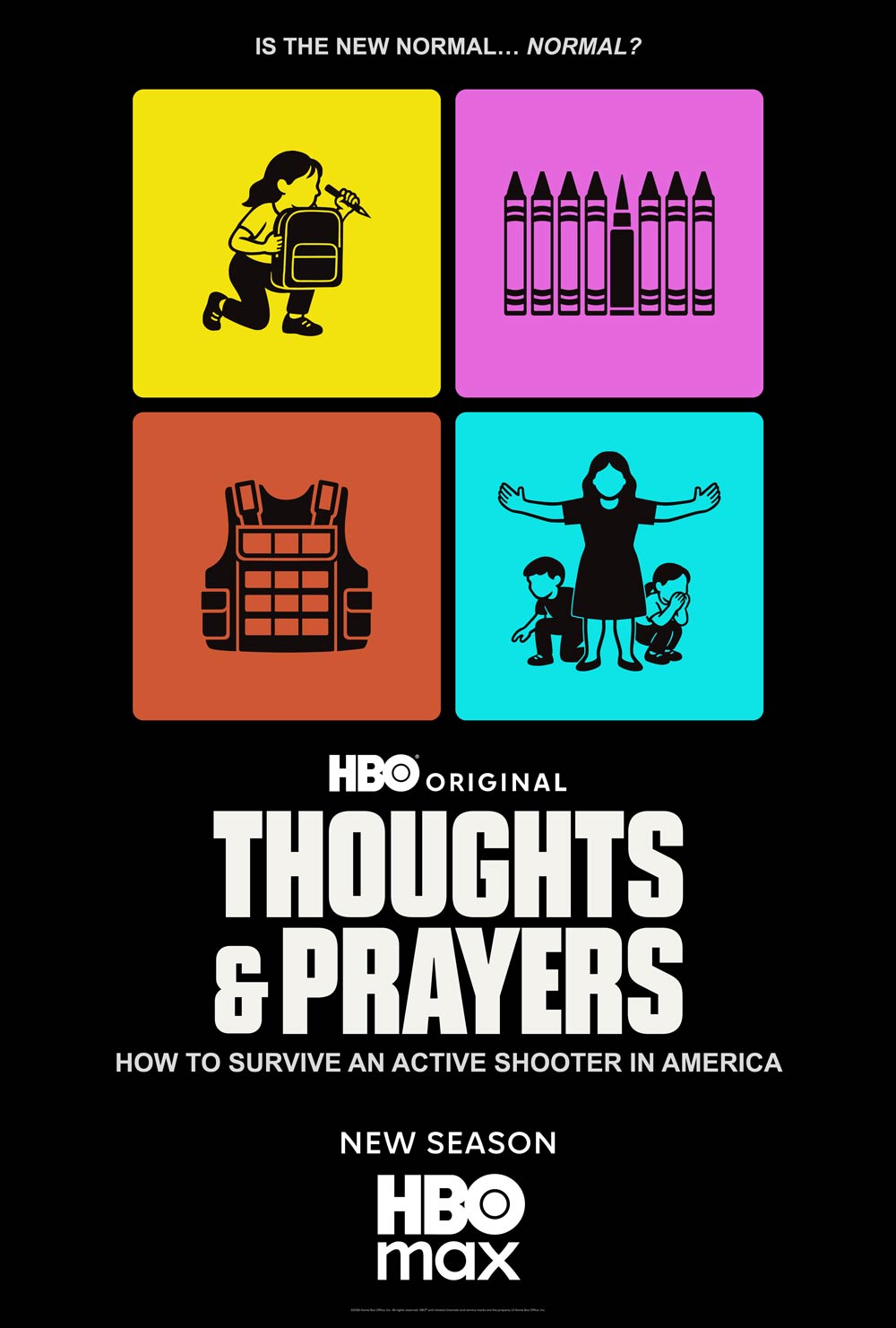
Genre: No tune-in date, genre indicator only. Used for post-premiere / continuity
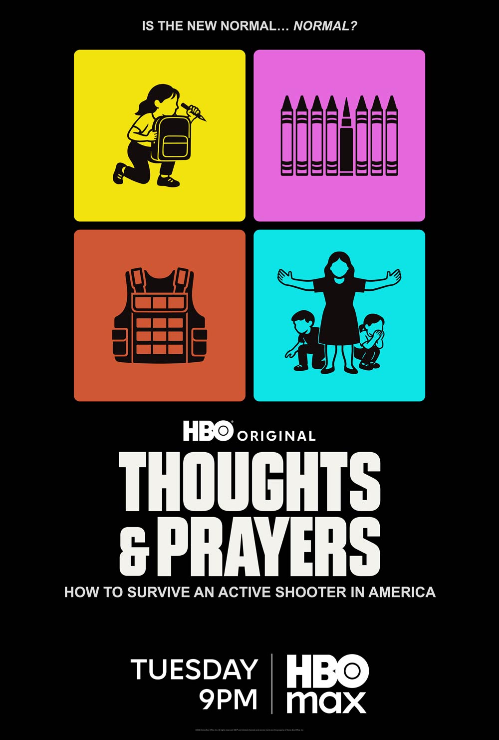
Day Time: Used for continuity
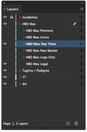
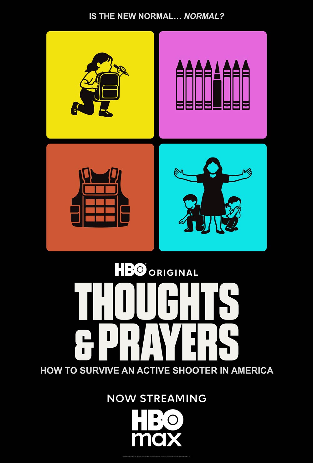
New Market: "NOW STREAMING” used for new markets only — not in established markets (e.g., U.S.)
HBO Max Logo Only
Tune-In Formatting
In general, follow the guidelines below. For visual balance, months and days may be spelled out or abbreviated as needed.
Months
Abbreviate:
- JAN
- FEB
- AUG
- SEPT
- OCT
- NOV
- DEC
Spell out:
- MARCH*
- APRIL*
- MAY
- JUNE
- JULY
*Use MAR and APR only when space is limited and/or the artwork merits it.
Do not add a zero before single-digit dates: OCT 5, not OCT 05
Days
Spell out:
- MONDAY
- TUESDAY
- WEDNESDAY
- THURSDAY
- FRIDAY
- SATURDAY
- SUNDAY
Only if space dictates, abbreviate:
- MON
- TUES
- WED
- THUR
- FRI
- SAT
- SUN
For continuity tune-ins, use the plural: MONDAYS, etc.
For post-premiere, the default is "NOW STREAMING." However, “STREAM NOW” can be used when space is limited.
Genre Indicator
Use Cases
Premiere: Use a genre indicator paired with a tune-in date.
Post-premiere/continuity: Use one of the following:
- Genre indicator only (no tune-in date)
- Day and time only
- “NOW STREAMING” (default) or “STREAM NOW” (as needed)
One-time event: Omit “NEW” for content intended to be viewed as a single event (exceptions: "X-PART DOCUMENTARY,” “X-PART DOCUSERIES,” “DOCUMENTARY SHORT”)
Examples:
Use abbreviated months with:
- NEW SERIES
- NEW SEASON
- NEW EPISODES
- NEW DOCUSERIES
- NEW FILM
- FINAL SEASON
- LIMITED SERIES
- COMEDY SPECIAL
- CONCERT SPECIAL

For visual balance, use spelled-out months with:
- NEW COMEDY SERIES
- NEW DATING SERIES
- NEW REALITY SERIES
- NEW DOCUMENTARY
- NEW DOC (when space is limited)
- X-PART DOCUMENTARY
- X-PART DOC (when space is limited)
- X-PART DOCUSERIES
- DOCUMENTARY SHORT

Note: When space is limited, owned and operated (O&O) assets may abbreviate months.
U.S. Key Art Legal
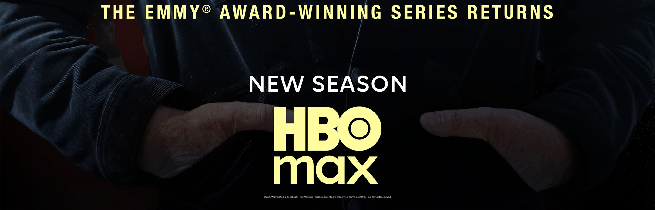
Legal lines are built into the templates and appear at the bottom of key art to identify the copyright owner. For specifications on placement, scale, and graphical effects, please follow the appropriate regional toolkits and templates. Please contact your local Legal team for more information.
Placements
Include a legal line on all printed key art, except for billboards where legal copy would be difficult to read at a distance. Legal lines are not required on digital assets.
Legal lines should be included on the following:
- Newspaper and trade ads
- Bus Shelters
- Kiosks
- Escalators
- Columns (e.g., Ivy Station)
Size & Legibility
Legal lines appear only on 27”x40” files and should be omitted from social assets and 48”x14” files. This is reflected in the templates — do not add legal language if it is not included in the template.
- Alignment: Centered to the key art
- Font: Max Sans
- Size: 3.5pt at final printed size; minimum 3.5pt. Only increase size if legibility is compromised at final scale.
- Color and opacity: May be adjusted as needed to improve legibility against the background.
Legal Copy
These are the most commonly used legal lines but may vary based on regional and brand considerations.
Standard WBD, including HBO Max and international titles
- ©2026 WarnerMedia Direct, LLC. HBO Max and related elements are property of Home Box Office, Inc. All rights reserved.
Shortened (when space is limited)
- ©2026 WarnerMedia Direct, LLC. HBO Max is property of Home Box Office, Inc. All rights reserved.
HBO Original
- ©2026 Home Box Office, Inc. HBO® and related channels and service marks are the property of Home Box Office, Inc. All rights reserved.
Program-Specific Legal Lines
Some IP require their own legal language to reflect brand requirements. Please confirm with your local Legal team as needed.
Examples:
Looney Tunes: LOONEY TUNES CARTOONS © Warner Bros. Entertainment, Inc. LOONEY TUNES and all related characters and elements are trademarks of and © Warner Bros. Entertainment Inc.
NFL
©2025 Home Box Office, Inc. All rights reserved. HBO® and related channels and service marks are the property of Home Box Office, Inc.
© 2025 NFL Properties LLC. Team names/logos/indicia are trademarks of the teams indicated. All other NFL-related trademarks are trademarks of the National Football League.
Peacemaker: ©2026 Warner Bros. Entertainment Inc. HBO Max and related elements are property of Home Box Office, Inc. PEACEMAKER and all related characters and elements are copyrights and trademarked of DC. All Rights Reserved.
Warner Bros. Releases
Standard
- ©2026 Warner Bros. Ent. All rights reserved.
Shortened
- ©2026 WBEI
DC Comics movie or series
- ©2026 Warner Bros. Ent. All rights reserved.
When a title treatment is locked up with the DC logo
- ©2026 Warner Bros. Ent. All rights reserved.
TM & © DC
Shortened combination WB/DC (as needed)
- ©2026 WBEI TM & © DC
DC series licensed to HBO Max
- ©2026 WarnerMedia Direct, LLC. All Rights Reserved. THE DC LOGO, [INSERT SHOW NAME] and all related characters and elements © & ™ DC Comics. All Rights Reserved.
Use Cases
Examples:
- HBO® Original
- Euphoria, House of the Dragon: ©2026 Home Box Office, Inc. All rights reserved. HBO® and related channels and service marks are the property of Home Box Office, Inc.
- Max Original
- The Pitt: ©2025 WarnerMedia Direct, LLC. HBO Max and related elements are property of Home Box Office, Inc. All rights reserved.
- Acquisition
- E.B. White’s Charlotte’s Web: ©2025 WarnerMedia Direct, LLC. HBO Max and related elements are property of Home Box Office, Inc. All rights reserved.
- HBO Max UK Launch: OOH
- WB Movies:
• Joker: © & TM DC © 2026 WBEI
• The Batman: © 2026 WBEI TM & © DC Comics
• One Battle After Another: © 2026 WBEI
• Superman: © & TM DC © 2026 WBEI
• Harry Potter: © 2026 WBEI Publishing Rights © J.K.R. TM WBEI
technical setup
Adobe Creative Cloud applications: InDesign, Photoshop, Illustrator.
All Text
- Live type built in InDesign (title treatments, taglines, critics’ quotes, tune-in, credit blocks, legal lines)
- Warner Bros. Discovery uses Monotype for all its font needs. For seamless artwork delivery, it is crucial to use Monotype fonts (live or outlined) throughout a project. If a Monotype font is not used, please alert your WBD project contact, as early as possible, on how to proceed.
Need a Monotype account? Please reach out to fontserveradmins@warnermedia.com. Only individual email addresses. No distribution lists, please.
Special Type Treatments
- AI, EPS, or PSD/PSB files with layers
- Include imported alpha channels and clipping paths
- For Illustrator outline type, include separate layer with live text (layer turned off) and MUST include font files.
Vector-Based Type
- Special type treatments should be placed in an InDesign layout for Concept + Design Studio (C+DS) to edit, as needed.
Please include all font details included in the final deliverables. This information will be used to confirm correct font application from the WBD Monotype library.
- All fonts in every instance should be from the WBD Monotype library.
- Avoid all usage of free fonts.
- Do not send font files.
- Avoid hand-drawn taglines.
- Avoid hand-drawn title treatments as they are not ideal for localization in our international markets. If hand-drawn type is absolutely necessary, be sure to include the entire hand-drawn alphabet and special characters. Also provide documentation stating permission for use of the customized hand-drawn font.
For any Monotype requests or questions, please contact: fontserveradmins@warnermedia.com.
If color is crucial and you would like to submit a color proof, it should adhere to Forga 39, GRACoL or SWOP color standards (Forga39 is preferred). The proofing equipment used should be regularly calibrated for color accuracy. An Epson contract proof on Matte coated paper is the preferred choice.
General Requirements
- Provide fully layered RGB PSD/PSB files. Please see the Photoshop files linked to the InDesign templates for dimensions, resolution, and bleed details.
- Please ensure that the artwork fully extends into the bleed area. This is essential for resizing and repurposing for platform, OOH, digital banners, etc.
- All color adjustments and effects MUST extend to the edge of the bleed area
- Large format OOH layouts (bus shelters, billboards, kiosks) must be built to vendor specifications in InDesign. Please include fully layered PSD/PSB files.
Vector Art
- Illustrator Al or EPS format (AI is preferred)
Photoshop Files
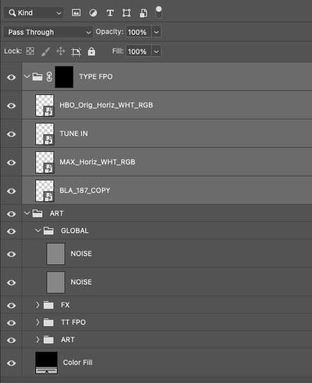
- Photoshop PSD/PSB files should be fully layered
- Images and vector graphics should be placed as smart objects
- Include any necessary alpha channels and clipping paths
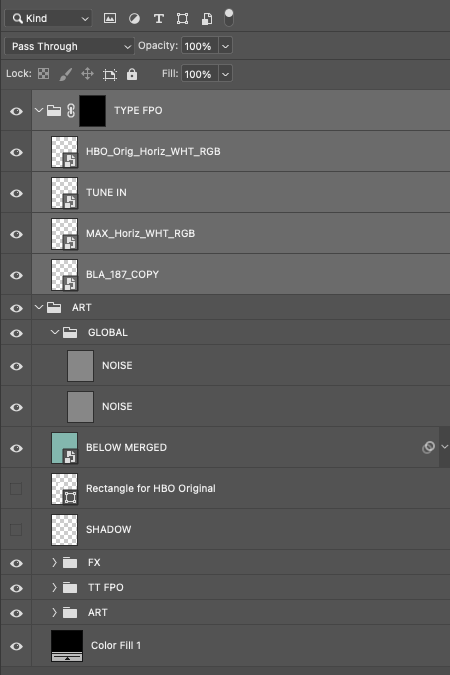
- ALL layers should be properly labeled including layer sets
Photoshop Files
- Photoshop TIFF: include alpha channels, clipping paths, and smart objects
- When your PSD is flattened, the size should be no more than 200MB
- PSD layers should be properly labeled within folders (see example)
Special Effects & Filters
- Include all Photoshop layers (not flattened)
- Indicate third-party plug-ins used (filters and all layers should be properly labeled)
Platform Key Art
Platform key art is often the first visual encounter audiences have with our content and products. Follow the specs and guidelines to create high-quality, platform-ready assets that enhance the streaming experience.
For guidance on platform art, please email: